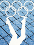
Last Friday saw the unveiling of the official posters for the London 2012 Olympic & Paralympic Game. It is the first time since 1972 that artists have created the posters, with a definite emphasis on showcasing London’s cultural olympiad rather than just the home nation. This makes a controversial topic as to whether the public and watchers worldwide will appreciate the individualism of such eminent Brit Art as opposed to the sleek, coherent graphic posters we are used to seeing.


One piece in particular that has divided the critics is Howard Hodgkin’s Swimming poster. Some applaud how he has captured the fluidity and movement of water and “the sensation of swimming”, others remark that it’s just ‘a blue splodge and a squiggle’. I feel it is very emphatic; the boldness of his brushstrokes links with the heightened adrenaline of the swimmer, power exudes from the deepness of the blue, motion aplenty shown by the differential tones and mark making (what lovely “squiggles”). If this is merely a reminder of a pre-schooler smudging paint on sugar paper then let your 5-year old nephew have a go.

Fiona Banner’s Superhuman Nude poster uses verbal descriptions to define her subject, in this case a Paralympic cyclist. Yes she uses not-so-family friendly words within her prose poem but her application of typographical treatment gives Banner’s description intensity and impact. Without using imagery, Banner is able to cast the naked form of the athlete into the viewer’s mind, to truly appreciate the strength and also fragility of the competitor waiting for that starting pistol to sound.

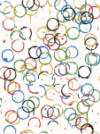
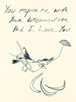
Then there’s Tracy Emin’s poster, Birds 2012. Surprisingly unprovocative, Emin adopts a more delicate and compassionate approach in her homage to inspiring Paralympic athletes. The scrawly nature of her illustration, in particular her handwritten message, coupled with the two small birds kissing on a fine branch brings a tenderness to the piece. Emin also incorporates the Paralympic logo within the poster, almost disguising the agitos as gently falling feathers or leaves. Thankfully one idea that Emin scrapped was titled “I might not always come first but I do enjoy sex”.

What is most striking however is how abstract all the posters are as if they could have been for any Olympics. Apart from Sarah Morris’s Big Ben poster (even this well known landmark is hardly distinguishable), they don’t directly relate to the host city or country. With the Beijing Olympics, they pushed the idea of heritage and cultural traditions, and with the Sydney Games there were boomerangs and aboriginal influences. Whether this was a statement to suggest timeless art, inclusion of the world to the London Olympics, or the egotistical nature of British artists, be ready to see these posters everywhere.
Tags: 2012, Anthea Hamilton, Art, Bob and Roberta Smith, Briget Riley, Chris Ofili, Fiona Banner, Gary Hume, Howard Hodgkin, London Olympics, Martin Creed, Michael Craig Martin, Paralympics, Poster, Rachel Whiteread, Sarah Morris, Tracey Emin

November 8, 2011 at 10:56 pm |
I like the squiggles the best.
November 29, 2011 at 4:19 am |
I like the squiggles the best.
+1
December 7, 2011 at 7:37 am |
Gabster…
Wonderful blog post!
January 2, 2012 at 9:34 am |
Rhyme…
Fantastic blog post
January 25, 2012 at 11:49 pm |
Great post :)
February 7, 2012 at 7:26 am |
Great job.
March 23, 2012 at 5:17 pm |
Wonderful blog post =)